I am not an architect and that will be apparent as you read further. However, I have a lifetime of interest in architecture, from drawing plans of fanciful castles when I was a girl to studying historical architectural as a teen, and reading architecture theory as an adult. It’s a lifetime fascination.
So getting to build a new house from scratch, where the kominka stood, is a real dream. Also a nightmare because I have to be practical and consider things like budget.
But like all creative projects, having constraints makes the imagination flower. I can’t source X in Japan; is there a different way to approach my goal? If I can’t A, can I B instead? Where do I find a balance between budget and desire? Constraints crystallise what is really important. Yes, a turret and moat would be nice, but I’d rather have a good insulation and zoned whole-house HVAC.
So I want to share my design process over the next couple of posts. Not in as much detail as it’s happened but with some drawings and explanations and such so that when you visit the house in real life eventually, it all makes sense.
First things first. My grounding in theory and goals for the house.
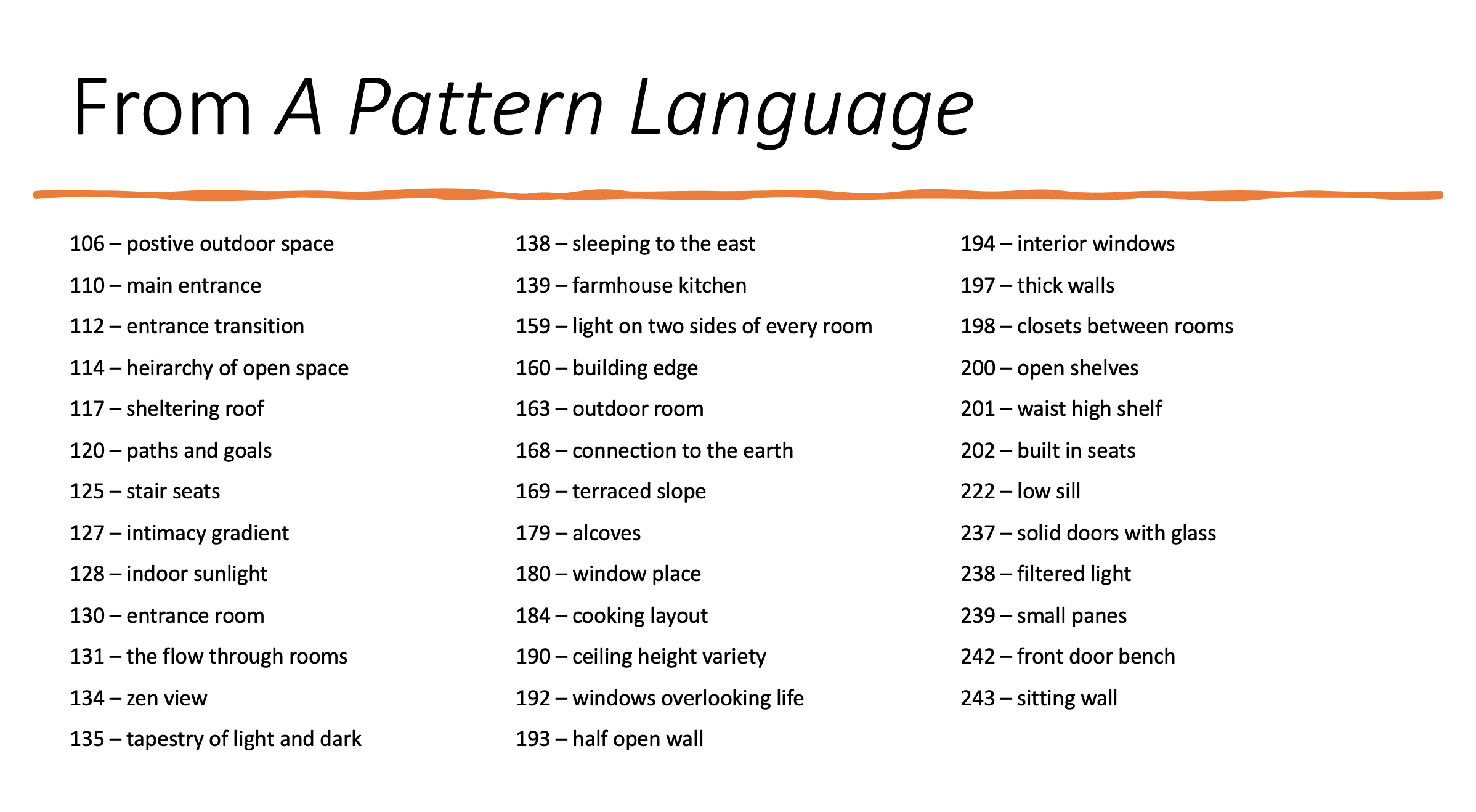
My guiding principles come from A Pattern Language, by Christopher Alexander (et al), which is an architecture theory textbook published in 1977. It was world-changing when I first read it decades ago – opening my eyes to the spaces around me. So my first stop was a re-read. And these 38 principles (out of 253) really struck a chord:

These cover interior and exterior points that I find very appealing. As I designed each version of the house, I tried to keep them in mind. I also had several key goals for the house:
- Aging in place – making provisions for future barrier free living
- Connection to the site, the fields & orchards, and the barn.
- Comfortable, welcoming spaces for gathering and working
- Balance of Western and Japanese, for example:
- Build on a 91 cm grid but wider doors and taller ceilings
- Kitchen with an oven, sufficient storage, & counters the right height
And finally, some aesthetic considerations to guide decisions:
- Engage the senses
- Good sight-lines to reveal the views inside and out
- Smell the breeze & hear the rain
- Natural textures – wood, sand, clay, metal, wool
- Cherish imperfection
- Reuse old materials & fittings
- Minimise plastic & smoothness
- Embrace the muddy reality of farm life
- Simplify lines and flourishes
- Reduce visual clutter without being boring or harsh
- If the house were a font, it would be a slab serif
On top of all those, I’ve spent a lot of time at the site observing things at different times of day, so I have a feel for the way light moves across the space, where the breezes start, how the house can nestle into the hill and garden.
With those in mind, I started to plan.


