With my theories and goals in mind, I was eager to draw some floorplans. I had all the measurements I took from the kominka, so I knew pretty well what sort of footprint I could work within on the site: 16 meters wide by 9.8 meters deep. South facing. After that, it was anything goes.

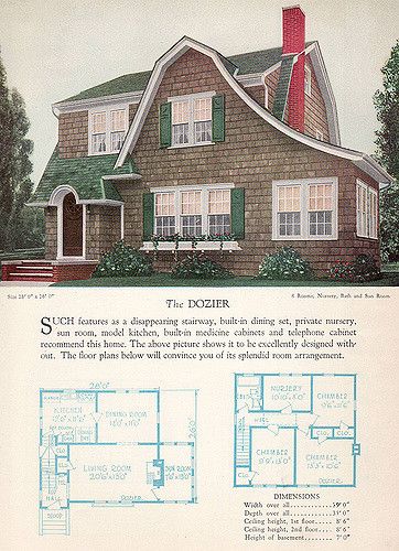
I actually started out studying old Sears & Roebuck house plans and others from the 1920s and 30s. They are small and tidy and they were affordable to build in their day. Some are quite delightful, like the Dozier (look at that gorgeous roofline!), but honestly not well suited to our modern lifestyle or my hope for barrier-free living.
Then I searched more modern plans online, but wow, they were problematic in the other direction – massive layouts that weren’t suitable for our lot. The ones that would fit were basic, uncreative and uninspiring spaces. No good. I’d clearly have to do my own designing.
I found an amazing free online CAD program: https://myhome-cloud.net/ It’s Japan based, so it forces me to design to the 91 cm grid we use here. That is an important constraint to follow if I want to keep a reasonable budget.
So I started to draw. My initial floor plan was based on an L-shaped house layout and it looked like this:

Note the awkward placement of the bath area. Access to the workroom through closets. Definitely not right, but it was a start. I redrew it in numerous iterations, and then had a conversation with Tod where he fondly mentioned his grandparents’ sunroom. Ah! Good idea. Back to the drawing board.

By the time I got to this one, I had moved the bath area to the northwest corner of the house. I put the sunroom in the southeast corner. There’s an office, a dining room, an entrance on the west side of the house. Almost everything had changed from the first concept, including the L shape.
At this point, I realised that I also needed to think about the exterior of the house. I read a scathing article about modern roofs and how lazy architects just plop them on based on the interior design without any regard for aesthetics. So I decided not to be a lazy architect. LOL. I spent a couple of days just looking at roof styles and playing with the 3D modeling aspect of the CAD program. I made a lot of really ugly houses with weird, glitchy roofs.
And then I discovered a roofline that is beautiful to me – clerestory (aka clearstory). Not only does it look nice, but it solves a problem of this design – there’s only northern light in the living room and kitchen. With a clerestory, I could bring in southern light through a band of high windows. And here is what came off the drawing board, eventually:
This exterior (with its CAD glitches and ugly wall treatments) goes with the very latest iteration of the interior:

This is getting close. If I compare it to my goals and 38 patterns, I am doing well! It’s still pretty big, 115 sq m, but if I want to make it more compact, I can cut out two north-south slices: one through the living area and sunroom, and another from the utility room through bedroom and get the area to under 100 sq meters:

There’s not as much breathing space in this version, but it would reduce the budget by 10% so I will keep it in mind. Because it looks like after we finish the house, we’ll renovate the barn and we’ll have another 80 square meters or so. That is a post for another day.