In about 6 weeks, I will be leading a workshop featuring “nature art” at the Oyama Senmaida harvest festival. Last year we explored a variety of ways to get color from plants and earth.
This year, something different: anthotypes. (antho, flower + type, print) It’s a fancy word for capturing shadows by sun-bleaching botanical emulsions.
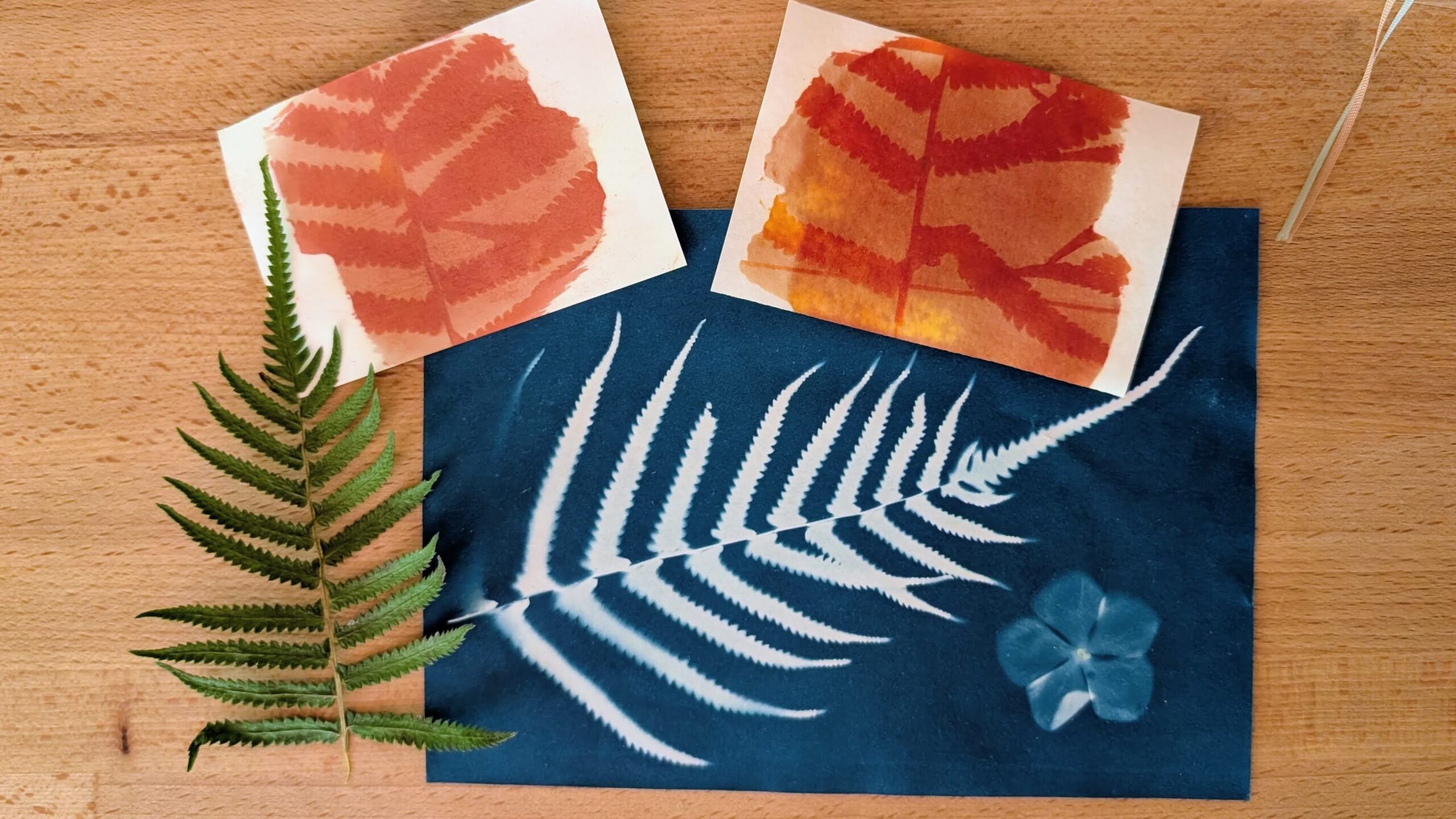
You might know anthotype’s cousin, cyanotype. It reliably and quickly creates a white image with a dark blue background like a blueprint. We will be playing with cyanotype in the workshop exactly because it is quick and reliable.
Anthotypes are anything but quick or reliable! They are unpredictable and for a 2-hour workshop, that can be disappointing. I have been trying to dial in a little bit of reliability. I have gotten beautiful results and utter failures in my anthotype experiments over the ten days. But zero reliability.
First Round: Last Year’s Turmeric Ink

I had some turmeric ink I made months ago. It still seemed well-colored in the bottle, but it was pale when brushed onto a watercolor postcard I had in the shed.
So I did some kitchen color work, making a fresh batch of emulsion with ground turmeric and ethanol from the medicine cabinet. 2 tsp of turmeric powder + 75 ml alcohol. Brushed it onto a couple more postcards and let it dry.
Then I arranged plants and sequins, clamped them under a sheet of acrylic, and let them sit in the sun for 45 minutes since that’s about the amount of time I’ll have in the workshop.
I also set up my 395nm UV flashlight to see if that would expose the paper enough to get an image in 45 minutes. Just in case we have a cloudy day; I want a backup plan.

UV flashlight was ineffective and the image on the old turmeric was invisible. However the sun did well on the ground turmeric emulsion, especially after toning it in baking soda solution to increase contrast and shift the colors to orange-brown.


In retrospect, this was one of the better results in terms of color. But the textured paper made the shadows soft. I was hoping for more crisp edges.
Second Round: Larger, Smoother Paper

I have a stash of watercolor sheets with a smoother texture that I thought might work. I coated them with leftovers of the turmeric emulsion from the previous day and set them up outside for a longer time on a partly cloudy day. After 90 minutes, I brought them inside to process.


The postcard paper worked much like the previous one, but I noted some weird flecking after it was toned – maybe excess emulsion? It’s kinda cool, but unexpected. After it dried fully, the flecks faded a bit.
The smooth paper was a failure. There wasn’t much contrast at all when I lifted the flowers and bottle label. Toning the sheets just make the low contrast a different color. Maybe the paper absorbed too much emulsion. The smooth stuff is inexpensive so maybe its pH is different as well.
This was not encouraging me for the success of the workshop. Paper choice clearly matters! I don’t have too many of the watercolor cards left. I would have to find more and I don’t remember where I got them.
Third Round: Cyanotype

I want my workshop attendees to have a success, so I dug out the cyanotype paper I bought 18 months ago. This chemical emulsion isn’t “nature art” the same way botanical emulsions are, but we can put nature on it. Or maybe I can print out some photos of Oyama Senmaida onto transparencies to use as the image. I don’t know yet, but first I needed to see if my cyanotype paper was still good.
I also laid out another sheet of the smooth watercolor paper to test exposure time. Maybe less sun would make a better image.


Grand success with the cyanotype!
Dad made blueprints at home when I was a kid; he was a draftsman. It seemed like magic then and it still does. Cyanotype paper fades in light the exact same way as the botanical emulsions do. When you rinse the finished sheets in water, the colors reverse. The emulsion is also very sensitive to tone so you get nice gradients. In this example you can see where the flower petal folded back on itself.
The turmeric anthotype test was magic, too, but not in a good way. The smooth watercolor paper is a bust for the workshop, though it has great potential for collage. Here it is before and after toning:


Fourth Round: Paper Choices

It’s pretty clear that paper has a lot to do with the contrast of the print. But I don’t understand why and I want to try to get a better picture of what’s going on. Back to the studio to find some other paper options. I am going to solve this problem one way or another. I grabbed three water color papers, three office papers, and my favorite smooth Kent paper. Seven different samples. Surely something will work well.
After cutting them into small pieces to fit under the acrylic sheet, I toned them with fresh turmeric emulsion and let them dry overnight. In the morning, I loaded thm up with ferns and let them sit in the sun for 45 minutes.
Here is how these turned out: before and after toning, and a few days later, completely dry:


Wildly different results! Acidity, absorbency, bleach, additives…I still don’t know what in the paper might influence these results. But I am not as despondent about the workshop any more. I have a few contenders. Whew.
Fifth Round: Other Inks from the Studio

Of course I cannot stop at just turmeric; I have to test some other emulsions. I know most of the botanical colors I make is not lightfast and will fade over time, so there are many options bottled up in the SHED.
I prepared a single sheet with four of my favorites: Roselle, Coreopsis, Goldenrod, and Red Shiso. These would need a long exposure so I checked the weather and it looked like two full days of sun in a row. Perfect.
I picked flowers from the garden to use as my images. The blocks looked so pretty with the fresh flowers pressed against them. But I learned a good lesson. If you are going to expose your anthotypes for a long time, used dried and pressed flowers. Fresh flowers will wither and shrink.


I don’t think that is the cause of this failure, though. Like the very first try, these inks were almost all made last summer. Perhaps two sunny days wasn’t enough – could need a month. Whatever the reason, there is almost no visible image. Very careful observation lets me see the faintest shadows, but only when I refer to placement in the first photo.
More to Explore
Anthotypes as a photographic process never really went anywhere. It was written into scientific literature by Sir John Herschel in 1839. But they anthotypes impermanent and slow. Herschel’s invention of cyanotype was far more commercially viable.
However, anthotypes are not abandoned to time. The art world still embraces them. World Anthotype Day is celebrated on the last Saturday of October and here is a gallery of images on Alternative Photography listing all the botanical emulsions that were used for the 2025 submissions.
The image below is from Mariam Matta’s excellent article “Impatient Anthotypes” on Alternative Photography (https://www.alternativephotography.com/impatient-anthotypes-high-contrast-emulsions/)

I sort of wish I’d seen this before I started experimenting. Now I have MORE experiments to do. Looks like I need to find some spirulina, at least!