I felt nostalgic when I came across a stack of old Family Circle magazines at Soro Soro Bread Studio. Family Circle was a staple of my childhood reading, full of home economics articles and recipes. It’s been years since I’ve seen one, but it went on without me and finally stopped publishing in 2019 after 87 years.
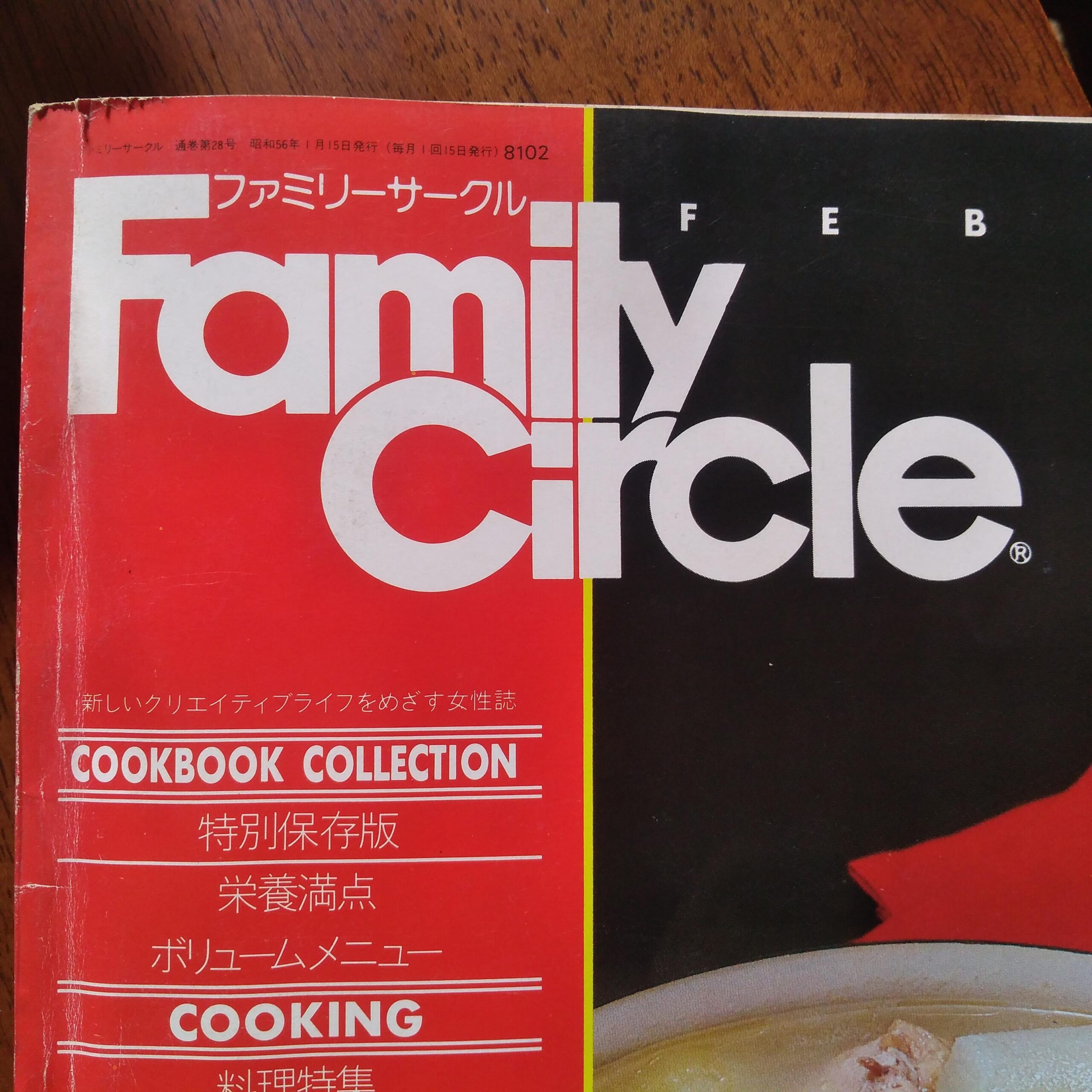
Anyway, while waiting for my pizza at Soro Soro and paging through the quaint articles from this 1981 Japan issue, I also had a good look at the cover. It took me by surprise. The thought given to the design of the logotype is incredible. That’s not something I noticed while reading cake decorating tips in the 1970s.
I often marvel over craftsmanship when I see old furniture or jewelry, but it exists in design, too. This version of the Family Circle logo was released in early 1967, so it’s over 50 years old, but it looks fresh and vibrant even now.
Let me give you a tour of why this Family Circle logotype is so well done.
First of all, the most obvious thing: the curved letters are circular. This is a not-so-subtle reinforcement of “circle” in the name. The center of the a, the capital and lower case c, and the e are all very round. The e is not a perfect circle but the choice to break it by pushing the top lip of the e out is more aesthetic than sticking slavishly to the circle format.
There is really so much going on here, that I’m going to walk through letter by letter.

F is a ligature with the a. This solves the problem of kerning the two and allows the lower bar of the F to sit at the x-height of the other letters. The whole of Family has a really strong, bold line at x-height from the bar across the tops of the stems other letters, which is important because there is a lot going on at the baseline of Family and in the center of the logotype.

The space between the a and m sets the tone for the other spaces between vertical letters (the i and l, for example). The thin gap is fully readable and narrow enough to keep the logo cohesive and not just a typed-out word.
The center of the logo is amazing. Look at how they stacked the lowercase i in each word. They are not the same size. But the square tittle is the same size in each and so is the gap between the dot and the stem.

The y plays an outsized role in this piece. There is a lot going on here! The l and y form a ligature to allow the descender of the y to cut into the ear of the r, which is trimmed at the same angle. Where does one start and the other begin? Well, at that narrow curved gap. Another lovely arc of circle.

The capital C pushing up into the baseline of the m brings another circle to the upper part of the logo. Note that the C is slightly wider the m above it and the counters (inner circles) of the C and a align at the same angle as the y’s descender.
Hats off to the designers. I would love to have been part of this design team and to know the people who created it. The design details speak to my aesthetic.