I have been a designer for a very long time – 40 years or more. Today I realised what a dinosaur I am.
Recently as I was working on a client project, I encountered a strange way of indicating bleed in an Illustrator template – a layer of 20mm rectangles on the edges and overlaps of the artboards.
It was so weird to me, that I couldn’t quite decide how to design with it. In my experience bleeds are specified as a layer of guides or as a measurement note on the template.

And a thought ran through my head – is this a European thing? Or maybe it’s how the kids today are using the tool? That I didn’t know the answer made me think about how differently young designers do things sometimes. Digital native are missing out in some ways.
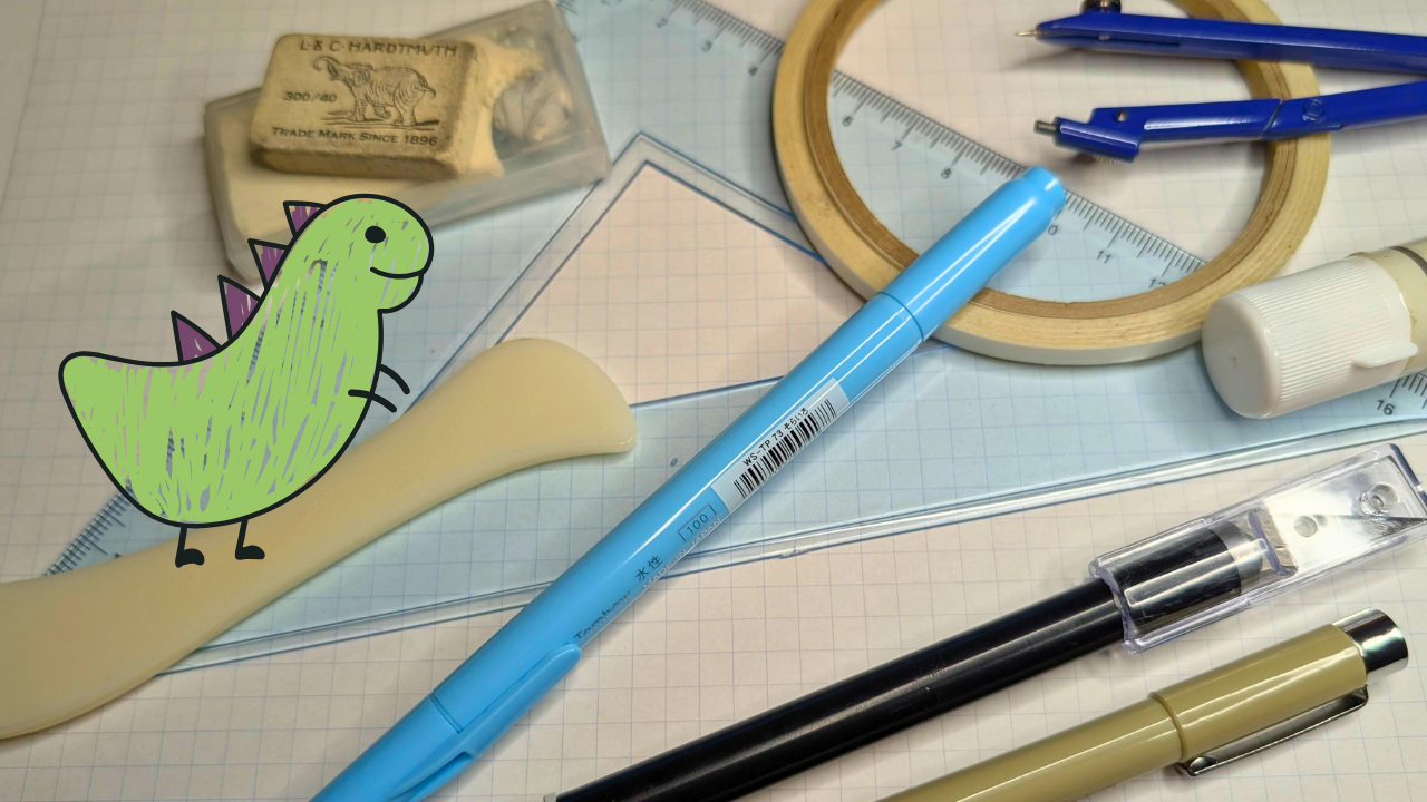
My professional life is rooted in physical media. Fellow designers, do you remember using any of these things for work:
- Non-repo blue (pens, pencils, grid paper)
- Layout sheets for column placement
- Dry transfer lettering
- Manual & electric typewriters
- Rule tape for fancy lines
- Rubber cement
- Wax transfer
- Spray adhesive
- Light tables
- Proportion rulers & wheels
- X-acto knives
- Color separations
- Film negatives for print plates
Design was a completely different experience when we worked with physical tools. It had a particular blend of scents, mostly adhesives. There were lots of soft, repetitive sounds before ASMR trended. We’d get scalded or nicked or sticky if we weren’t careful. Mistakes were irritating to correct: peeling off a long strip of line tape that had gotten kinked or slightly angled was the worst.
When computers came around, we mixed physical techniques and digital tools for a while. In the mid 80s, not all of the print shops handled digital and some had specific pasteup sheets that they would not give up, so we’d design in Pagemaker or Corel Draw, print out the design on the LaserWriter, and glue it to the required sheet. Sometimes we jumped ship to print plants that could handle our new workflow so we could courier floppy discs to them.
I trained on digital tools that were all version 1.0. They were rudimentary by today’s standards. If I wanted to place objects around a circle, I did the math required to determine the rotational angle of each object.
My employers paid for me to attend off-site seminars to learn how to do the advanced stuff. Eventually those days passed. When enough designers asked for new feature, the developers listened and automated tasks. No more seminars required.
For a while, I even dabbled in programming PostScript. That didn’t last long, but it was interesting way to approach design. Very precise and mathematical.

So I can’t help but look at design in a certain way. I don’t long for the old days and I rarely even think of them, but they form an armature for how I understand design process.
Now I use apps like everyone else, though I don’t know all the shortcuts. I occasionally have to Google how to do certain tasks. I am usually humbled by the answer being “option-click, drag to select, then press M” or a similar key combo completely separated from the math underneath.
Maybe the same is true for younger designers, but in reverse. Could it be that they aren’t familiar with print conventions, so they used 20mm rectangles to indicate bleed instead of guides?
Quite possibly. The other day I laughed over a meme saying Gen Z are touting the benefits of “micro-retirements” of two weeks a year where they unplug from work. They seem to have coined a new word that’s completely unnecessary.

So back to that design template. I took my best guess on why they used such odd bleed markers and I tried to conform to them. This morning, the printer sent my work back! Shaking my head, I adjusted the design to account for the bleed in the way I would have done it in the first place.
I’ll bet the printer’s my age.


