When I was a younger woman, I was fascinated by package design. I loved the way cardboard boxes could be fashioned in surprising ways to safeguard their contents. Tetrapacks were lovely little puzzles which I finally solved; see my Tetrapocket pattern from 2006. I seriously considered a degree in industrial and package design.
In my first design job out of college (where I had majored in education instead of design), I was executing layout for a foodservice company. I saw lots of packages. I learned all about the legal requirements of labeling for domestic and export products. I had exposure to great design, terrible design, and everything in between. I made mental notes that have influenced my designs all through my career.
But I never got to design a package. Until recently.

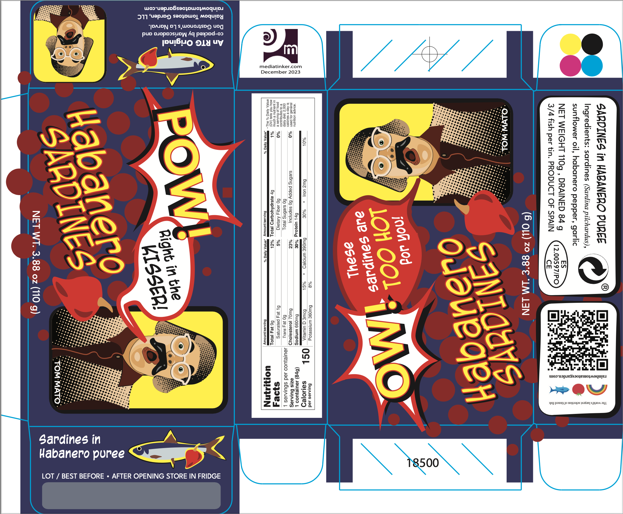
In spring of 2023, Rainbow Tomatoes Garden started work on producing a tin of sardines in habanero puree. I designed the label.
My first instinct was to think beyond this single product into a full line of RTG tinned fishes. I know Dan and he always thinks big. No way would he stop with one tin, even though this was the only one on the horizon.
With “rainbow’ in the company name, maybe each product could be a different color of the rainbow, with a rainbow forming the background of the small sides of the box?
But Dan had a different image in mind. “ ‘Pow, right in the kisser’ with the Pow being the classic comic book splash,“ he texted me. ”Comic-book-y all around. Maybe even showing the halftones ala Lichtenstein. Or not. Maybe too small a canvas for that.”
Challenge accepted! I drafted a loose comic book design with clip art as a proof of concept.


And then Dan had another idea. What if the clip art character was switched out for Tom Mato? Tom was reporting on the tomato garden that RTG is named for and also creating funny fish videos on YouTube.

And off to the drawing board I went. Jenny sent me some shots of Tom and his goofy expressions. I picked one that best shouted “POW!”
Dan has great ideas. I felt like I was able to execute them solidly, adding my own touches as I went. From the general concept and Tom Mato, it was a matter of refining the design, color by color, font by font. Towards the end of the process, almost half a year from when we started, I rendered the nutrition label, and added the package weight and other details from the manufacturer.

Pow! Sardines in Habanero Purée launched earlier this month. My design is out in the real world! It’s getting mentioned in reviews, too. People like it. And in a market full of excellent designs, it’s a thrill to know that this one holds up.


I still have a rainbow of color options for future products. Perhaps a different Tom face for every fish? We’ll see what Dan dreams up. He is a chef and a sardine connoisseur, after all.