Well, I am back to the 555 drawing board, literally, as I design hardscaping for the patio. Unlike my garden plans which are subject to change even after implementation, putting in hardscaping requires precision and finality.

I want to get the patio done before Tod’s mother and her husband visit during Golden Week towards the end of April. I had already lined up Fujii-san and his crew at a meeting in mid-January, but we needed to talk details. And we finally did that this morning.
Patio Plans


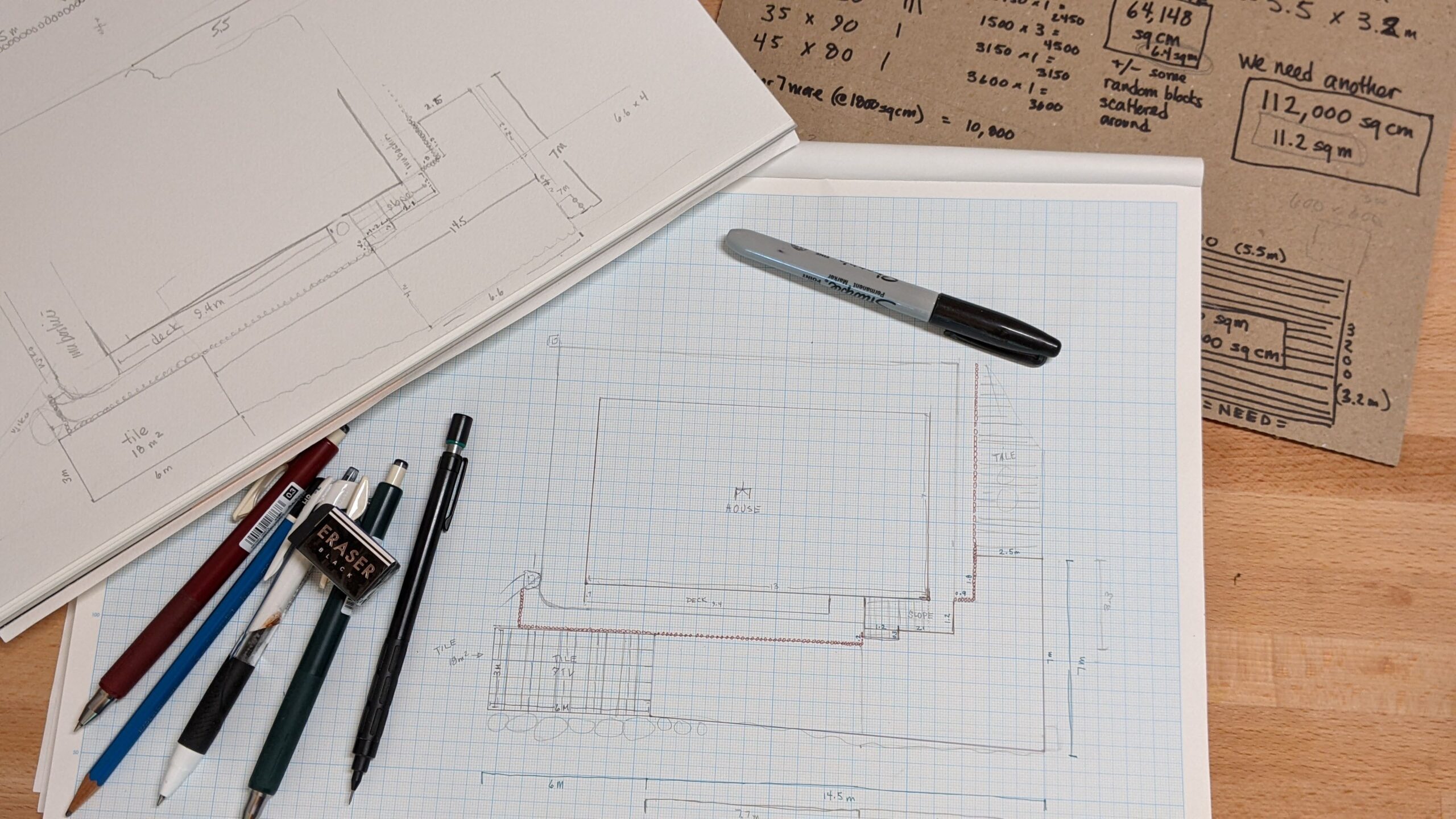
I had thought to use stones previously in the driveway to built the but after measuring and calculating their area, learned they are woefully inadequate. Only 6.4 m2 for a patio that will be 18 m2. To buy enough stone to fill the remaining space would cost close to 400,000 yen. That’s sort of expensive. What to do? Maybe I needed to rethink my concept.
Luckily this morning before the Monaca crew arrived for the meeting, I had an idea. If you’ve been following along the 555 saga, you will laugh. My idea is to use tiles that match the ones we laid in the doma and on the front stoop.
I think this tile plan makes a lot of sense. It visually connects the patio and front stoop in texture and color. And it coordinates conceptually with the striped tiles over on the east side. Plus I think a flat surface for al fresco dining or yoga sessions in the sunshine will serve us better than lumpy natural stone.
So 20 cases of good old “Perni” in color 24, which matches the local dirt, were ordered this afternoon and will be delivered next week. Now I get to decide on a pattern. I bought two sizes of tiles – 60×60 cm squares and 60×30 rectangles – because the rectangles were on sale for half off and I couldn’t resist the savings. I could do a number of different patterns in my 6 x 3 area.
The Path & the Approach
I still have the 6.4 m2 of stone – and there are other materials piled around, too, including bricks, cement drilling cores, and garden edging. I will use them to make the path from the patio to the front of the house and to create a landing space at the front of the house.
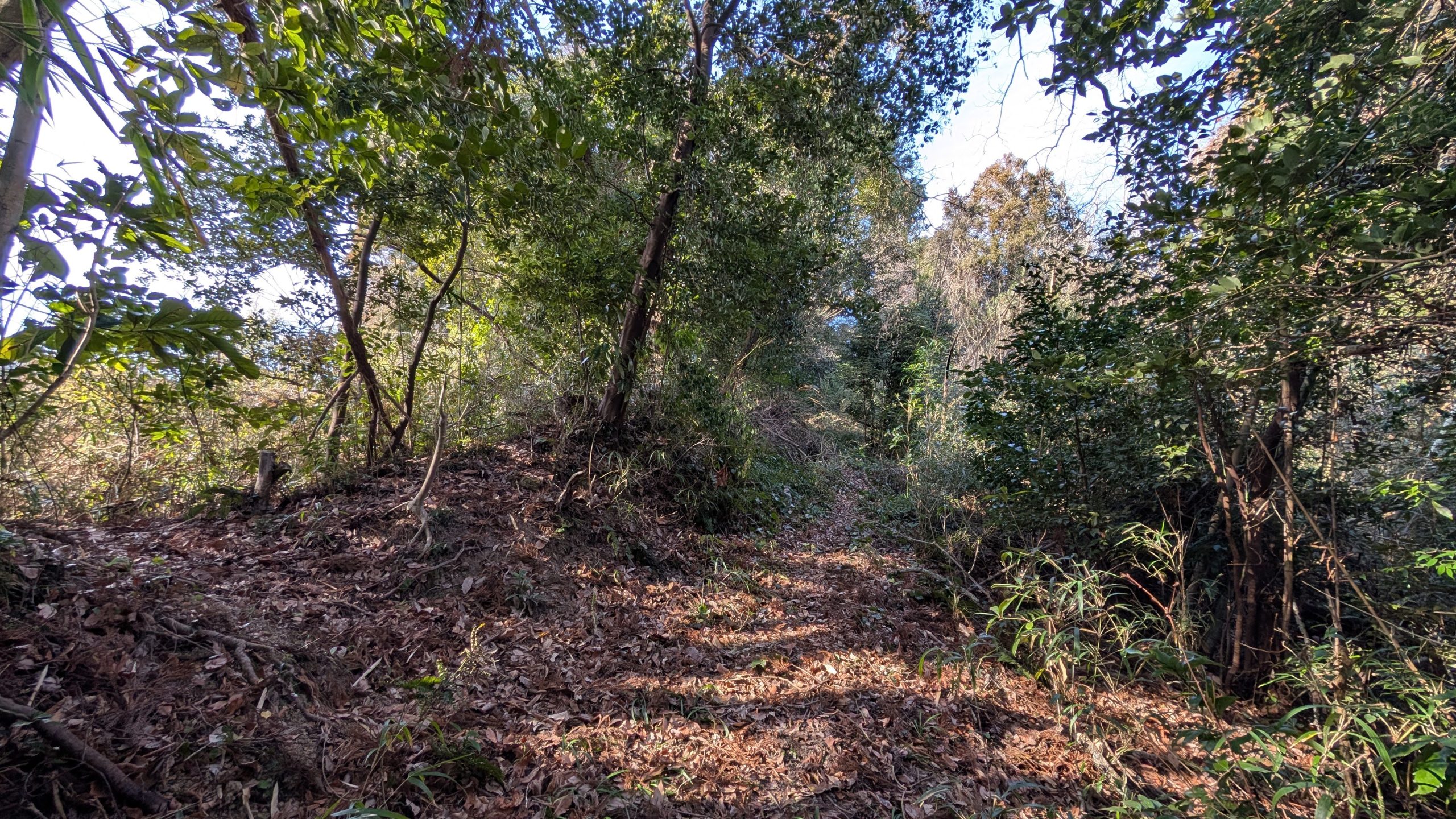
For the path, I am inspired by paths like this one:

I like this style because while it’s walkable and mowable (important!), it’s neither straight or perfect. It’s wild and tamed at the same time. I think something like this would be a good transition between the patio, the area in front of the house, and the front garden. Also, if we need to dig it up to get at the water service pipes, that isn’t going to be too difficult.

According to my drawings, the path section is 7.7 meters long by 3 to 4 meters wide. Even if I make half of that greenery, I will still require about 15m2 of stones and paving stuff. I might keep the path very sparse and plant it simply with clover, thyme, and some things in pots to start. It will be a fun space to experiment with over the years.

The front door approach sorely needs some sprucing up.
It’s quite large, to be honest. From the front step to the garden’s edge is more than four meters and it leads into the driveway. There’s a large section towards the barn and leading to the east side tile stripes. Measuring and calculating all of it together, I came up with 34 square meters.
Unfortunately, I do not have any strong visions yet. I have seen all kinds of beautiful things on Pinterest, like these:


Before I fall into a design rabbit hole, I need to think about utility. How do we currently move through the spaces in front of the house? How did I imagine we’d use them? What needs to be different for that imaging to come to life?
Most fundamentally, in front of the door should be a safe approach with clear access to the slope, too. Ideally suitable for navigating in the dark on moonless nights when we forget to switch on the outside lights.
So that means spaciously wide, smooth and even, no obstacles or abrupt elevation changes, and probably a pale color to reflect light.
SIDENOTE: STAIRS
I realised today, while examining the front stoop that our stairs are sort of in the wrong direction.

Nobody throws open their door wide and walks straight out of it. Maybe it happens in movies, or when you have a bunch of guests arriving, or if you have a servant there to open the door for you.
In daily life, I shove the door open halfway, which is enough space for me to pass. And then, every time, I step on the far left of the stair. Our stairs are straight in front of the door, rather than extending to the left the way we actually use them. If I misstep, I will tread on the boxwood. Coming in is an equal issue, as the slope starts just a bit past the leading edge of the door. I reach for the handle and take a step back onto the slope every time I open the door, It’s a gentle angle, but still. I wish one of the experts on this project had pointed that out to me.
I might not be able to change the slope, but I can find a way to extend the step.

Also, in that space in front of the door, we sometimes park vehicles when we have visitors. So it would be good to keep the area strong and solid enough for cars and light trucks. No thin tiles. No spikes. Nothing on the edges that will be ruined if a car rolls over it.

There is also the place where we use the sink. And what seems like a lobby for the striped tiles. There is so much movement in and out of this 34 m2! And it is even more of a wreck than usual, since I am very slowly extracting things from the barn and I haven’t gone to the dump yet.
Those plans include removing the exterior walls and windows. I need to do that work before I can decide about the hardscaping. The barn’s going to look different without walls and it might change our movement patterns. So I guess I’m going to do some gentle demolition tomorrow to get a view into that. Maybe I will be inspired.
Because right now, the area in front of the house and barn seems like a hot mess. The closer I look, the more I see mismatched materials, textures, shapes, and sizes. All sorts of misalignments from decades of getting things done efficiently. I do not like it. I bothers my sense of correctness.
My design is going to have to do some very heavy lifting to make this feel cohesive.


