I have put off a big part of the 555 planning, and that is lighting. Included in our quote is a basic lighting setup but even as I agreed to it, I knew it was inadequate. I like lights and this house has potential for interesting lighting inside and out.
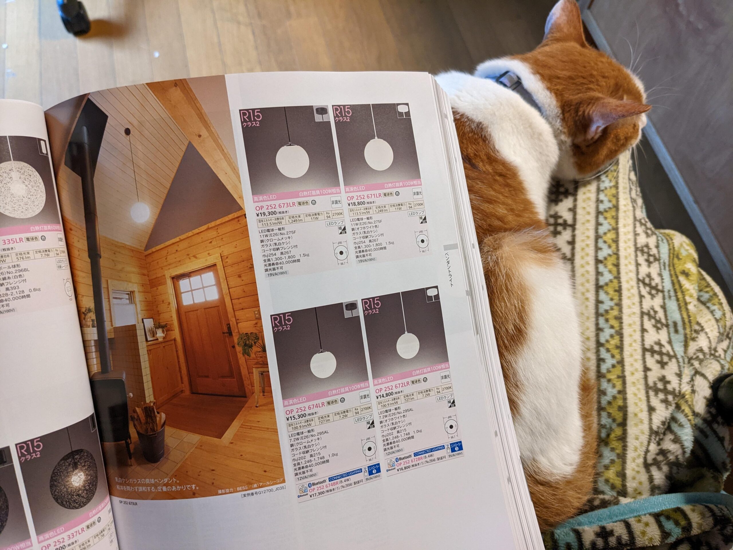
Friends recommended that I look at Odelic for fixtures that are stylish and have the “modcons” of color shift and dimmability. After perusing the Odelic online catalog Tod requested a physical version, which arrived yesterday. It’s glorious! 1200 pages of lights of all kinds. Just one pass through and I already have some good ideas.


I also looked at the Koizumi web catalog; another behemoth. It has some really different styles, too. And also lot of good ideas and tips for lighting outdoors.
One thing I have been disappointed by in both catalogs is the kitchen task lighting. Since our kitchen opens into the living space, I want to be able set the lighting flexibly. They only offer cold white, non-dimmable LED lights for the kitchen task lighting. (Odelic has the “modcon” lighting for overhead fixtures, but not task lights.) I suspect we are going to have to figure out our own system of weatherproof LED strips and a separate controller.
Looking at the catalogs has raised all kinds of questions about the lighting design. Simple stuff like:
- Which fixtures afford the most versatility or best spread of light?
- Should I do the math to calculate lumens for each space?
- Where should I mount the fixtures – ceiling, beam, wall?
- How are we going hide the cabling if they are mounted on beams?
- Where am I happy to have things wired-in permanently and where do I want to have the standard Japanese lighting sockets so fixtures can be exchanged for a different style later?
And a less simple (and more critical) question is “What does this space even look like?” It is difficult to visualise the complicated angles of the roof and lofted ceilings of the kitchen/dining space and the doma

I know there are beams running at 2.4 meters which intersect at the center of the kitchen/dining space. Then above that, the roof comes in at multiple angles:
1. The west side rises at an angle for 1.4 meters (ish) to the center of the room.
2. Then the west roof becomes vertical and has a a triangle window.
3. The north and south sides angle to the peak of the roof, almost 6 meters from the floor.
4. The north, west, and south ceilings join at an angle rising towards the center of the room.
We have a similar shaped lofting vertical space in the doma/entry, with a smaller footprint.
Since I didn’t get a 3D model to explore the house design by myself, and it was “too difficult” to share the screen in a Zoom call, I received a handful of printouts with angles selected by Teramoto-san and his team. They helped, but were not quite adequate for my imagination.
I might have to wait until I see the physical space before I can finalise the lighting design. But that’s going to push the entire timeline out. I need to do better with imagining the space. I could make a model…
I’ll have a chat with Sasaki and Stephen and we’ll figure it out. 🙂
